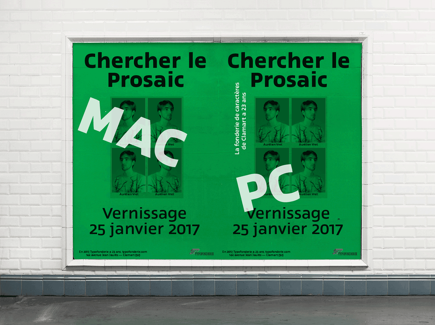
Prosaic designed by Aurélien Vret is a Postmodern typographic tribute to the french vernacular signs created by local producers in order to directly market their products visible along the roads. These signs drawn with a brush on artisanal billboards do not respect any typographic rules. The construction of these letterforms is hybrid and does not respect any ductus. Nevertheless the use of certain tools provokes a certain mechanism in the development of letter shapes. It’s after many experiments with a flat brush, that’s these letterforms have been reconstructed and perfected by Aurélien Vret. This is the starting point for the development of an easily reproducible sanserif with different contemporary writing tools.


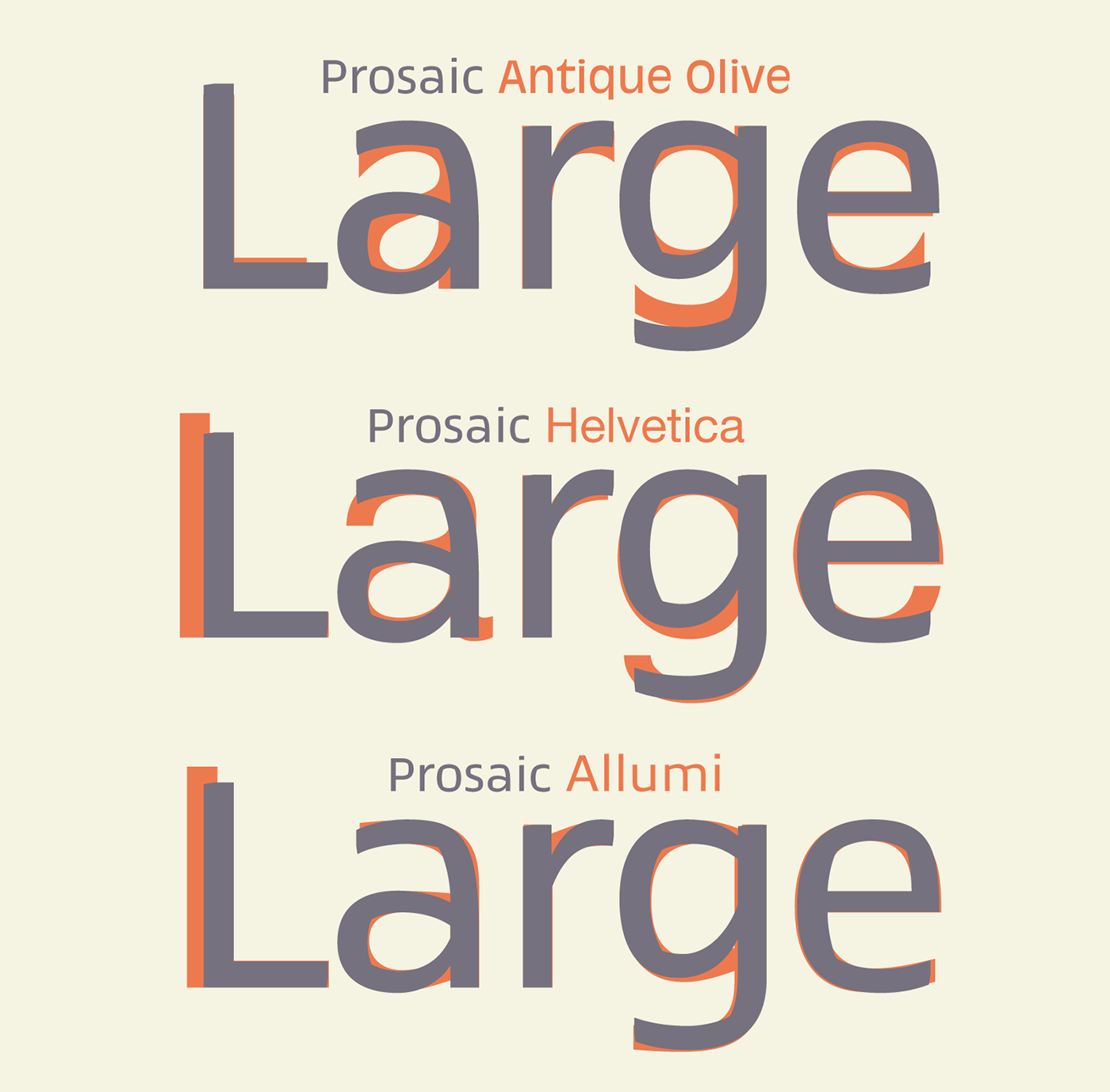
Disconnected to typical typographic roots in its elaboration, Prosaic is somewhat unclassifiable. The formal result could easily be described as a sturdy Postmodern humanistic sanserif! Humanistic sanserif because of its open endings. Sturdy because of its monumental x-height, featuring a “finish” mixing structured endings details. The visual interplay of angles and roundness produces a design without concessions. Finally, Prosaic is Postmodern in the sense it is a skeptical interpretation of vernacular sign paintings. Starting from a reconstruction of them in order to re-structure new forms with the objective of designing a new typeface. Referring to typographic analogy, the Prosaic Black is comparable to the Antique Olive Nord, while the thinner versions can refer to Frutiger or some versions of the Ladislas Mandel typefaces intended for telephone directories. To a lesser extent, the search for forms and counterforms can be reminiscent of Jeremy Tankard’s Fenland or certain Evert Bloemsma typefaces such as FF Balance or FF Legato.
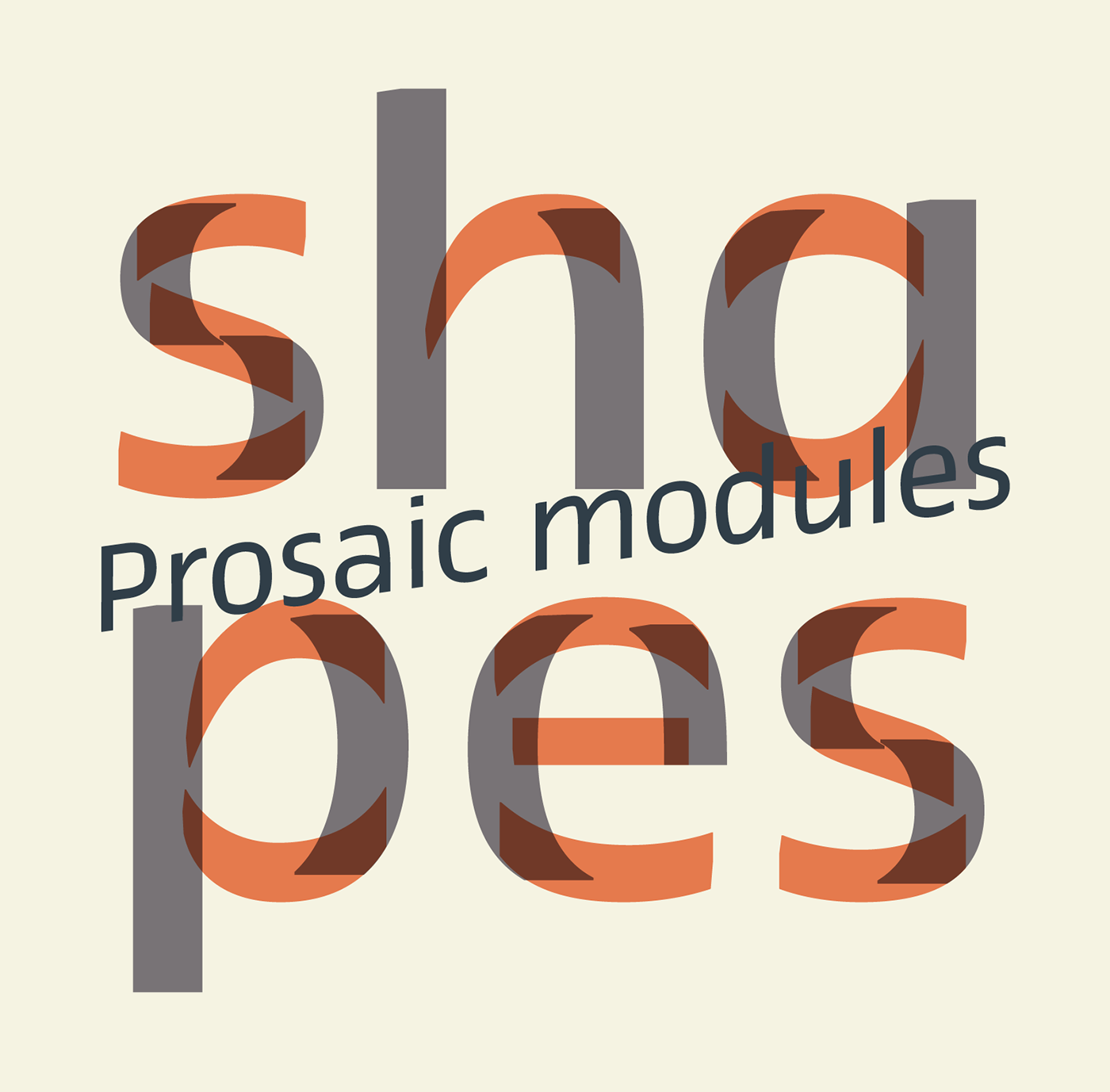


Prosaic is radical, because it comes from a long artistic reflection of its designer, Aurélien Vret, as well a multidisciplinary artist. The Prosaic is also a dual tone typeface because it helps to serve the readability in very small sizes and brings a sturdy typographic power to large sizes. A series of ligatured capitals, influenced by handcrafted lettering construction shortcuts is available in all styles, romans and italics, from light to heavy weights through OpenType functions. Some more or less cursive variants of the g, y or z, the latter in a more Germanic spirit are also proposed in Prosaic. Of course, Prosaic glyphs follows the same rules as any other typeface published by Typofonderie, including a great language support and will satisfy experienced graphic designers needs: small caps, fractions, superiors, etc.
Prosaic designed by Aurélien Vret is exclusively available at Typofonderie. This new typeface family includes romans and italics in 18 styles, to accommodate diverse uses. Prosaic designed by Aurélien Vret has been under the guidance of Jean François Porchez. since he submitted his design to Typofonderie in 2012 as a short set including capitals, lowercases, numerals and few punctuations. Prosaic includes now more than 900 glyphs by font, extended languages support, 4 sets of figures, capitals, small caps, lowercases, superiors, ligatures, alternates, stylistic sets, contextual alternates and dingbats.

Prosaic: Availability of the new typeface family
The new Prosaic OpenType fonts are available in our STD, ePub versions and exclusive PRO version. Download the Prosaic specimen in pdf format for full details of these Advanced typography functions. You may enjoy the free Try-out version too!
→ € 45 – € 55 for any of Prosaic styles STD or PRO
→ € 119 – € 146 for the Prosaic Family of 4 fonts STD or PRO
→ € 466 – € 569 for the Prosaic Full Family of 18 fonts STD or PRO

As a tradition, at Typofonderie, we test a new typeface family on various applications, using existing designs. It’s the final step of any project and it’s great fun for us. See our Fonts in use section for more.